
Web Design for Restaurants: A How-to Guide
Last Updated: March 12, 2025
Web design for restaurants is often the first interaction customers have with your culinary world.
So, creating a website that engages and converts visitors into paying customers is the best way to enhance your online presence and sales.
Just like appetizing food and drink offerings, an enticing ambiance, tech-savvy tools like QR code menus, and impeccable service, your website design plays a vital role in attracting diners and leaving a lasting impression.
If you want to learn how to design a high-functioning and engaging website, you’ve landed on the right page.
The secret ingredient to perfecting your restaurant website lies here. Read this helpful guide on how you can create an enticing website design.
Must-have web design checklist for restaurants
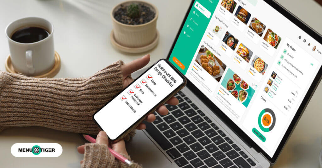
Here are all the things you need to consider when designing or developing your restaurant website:
Mouthwatering menu
Your restaurant’s menu is the heart of your web design. It should be easy to read, with high-quality images and detailed descriptions of your dishes.
Make sure it’s mobile responsive—data from Think with Google shows that 89% of restaurant searches happen on mobile devices before customers visit a restaurant.
To make an enticing design, look up some of the best art of menu design tips and ideas to easily craft your restaurant menu.
Easy reservation process
Incorporate a reservation system into your website. Data from OpenTable highlights that 83% of diners prefer to book online, and another 86% say they would use reservation platforms more often if more restaurants offered them.
These numbers prove that restaurant websites with integrated reservation systems will see an increase in their bookings.
So make sure your restaurant’s online page is user-friendly, enabling your potential diners to secure their spots with just a few clicks.
Website simplicity
In a journal published by website visitors, they form an opinion about a site’s design in just 0.05 seconds.
A study by Google found that 53% of mobile users abandon a website if it takes more than 3 seconds to load. Speed and simplicity go hand in hand in web design.
The more clutter or elements you have on your website, the longer it takes for it to load completely.
To make a positive impression, start with a clean, simple restaurant website design. Clutter-free pages, intuitive navigation, and easily accessible information are essential.
High-quality imagery
People eat with their eyes first, and your restaurant’s website should offer a visual feast.
According to statistics by SocialChamp, a social media marketing management tool, content with relevant images gets 94% more views than content without images.
High-quality, professional images of your food, restaurant interior, and staff can make a significant difference in enticing potential customers.
Display reviews and testimonials
Showcasing reviews and feedback from satisfied customers can boost your restaurant’s credibility.
BrightLocal, a digital tool for local Search Engine Optimization (SEO), found that 87% of consumers read online reviews for local businesses to help them decide where to spend for food or services.
While 37% of the same sample size from the same survey gravely depend and read on the ratings before deciding.
Displaying your customers’ testimonials will not only boost your restaurant’s reputation but will also encourage prospective customers to try what you have to offer.
Consistency and branding in the web design for your restaurants
The web design for your restaurant should reflect the same restaurant themes, style, colors, and tone as your physical restaurant.
Lucidpress, a web-based desktop publishing software, reports that consistent branding across all platforms helps you increase your revenue by an average of 23%.
Now, this means that the more people see your brand—whether online or offline—the higher the chance they’ll buy your products or pay for your service.
Strategically showcasing your branding establishes your reputation and identity on online platforms. One of the best ways to maximize this is to enable a white label for restaurant domain on your chosen domain provider.
So make sure that you have perfectly aligned your visual identity, social media posts, menu design and offerings, and all other encompassing factors.
Social media integration
Adding your restaurant’s social media profiles to your website is a smart move. It helps you connect with your customers in real-time.
According to recent restaurant social media statistics, 51% of diners use social media to decide where to eat, so it’s a big deal.
This keeps your website fresh since you can use the eye-catching photos from your social posts to make your site look even better.
You can also share real moments, customer stories, and daily specials, all while keeping everyone updated on events and tasty new dishes.
Interactive Restaurant Menu Software
Web design and development for restaurant businesses is made possible with reliable restaurant software.
With an active paid plan, you’ll learn that it’s more than just a customization tool for your printed or tablet menu.
It’s also a smart and practical alternative to website builders.
It offers all the basic tools and options you need to establish a website for your restaurant. And this already integrates your digital menu, e-payments, survey forms, and customer analytics.
Ultimately, you’ll need to look for one that lets you establish your online site without coding or any software programming needed.
You can begin by determining which of the existing software today lets you structure your website, section it according to functional pages (i.e., menu, about us, contact information, home page, etc.), and offer an editable digital or QR code menu to match with your visual branding.

Samples of web design for restaurants
Looking for web design examples for restaurants and other hospitality-industry businesses? Here are nine outstanding websites that set the bar high:
Eleven Madison Park (New York, USA)
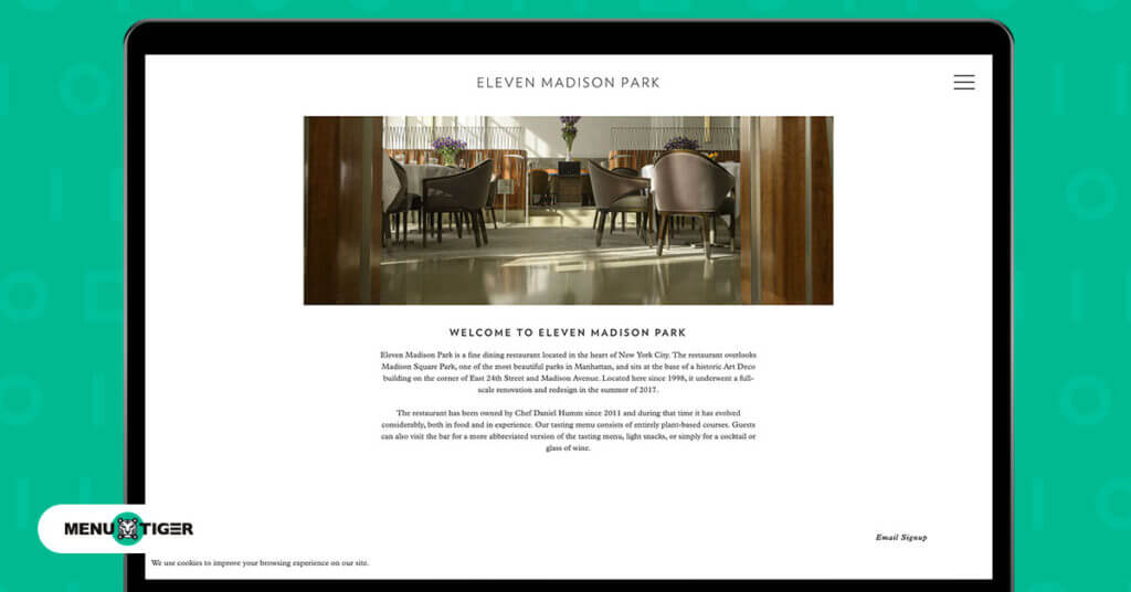
Step into the virtual realm of elegance at Eleven Madison Park’s website. It’s all about simplicity—a clean canvas that showcases their culinary artistry.
High-quality imagery transports you to their exquisite dining space, and the minimalist design provides a delightful user experience.
The reservation system is a breeze to navigate, and you’ll find seamless integration with their social media profiles to keep customers connected.
Noma (Copenhagen, Denmark)
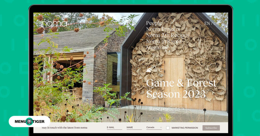
Noma’s website is a visual delight, much like Nordic cuisine. The design is a masterpiece with parallax scrolling and interactive elements that draw you into their world of gastronomic innovation.
It’s not just a restaurant website; it’s an experience, making it one of the best web design examples for restaurants.
Their tasting menus are meticulously detailed, and you can easily make a reservation.
It’s a one-stop shop featuring not only their food but also their social media and an online store for merchandise.
Alinea (Chicago, USA)
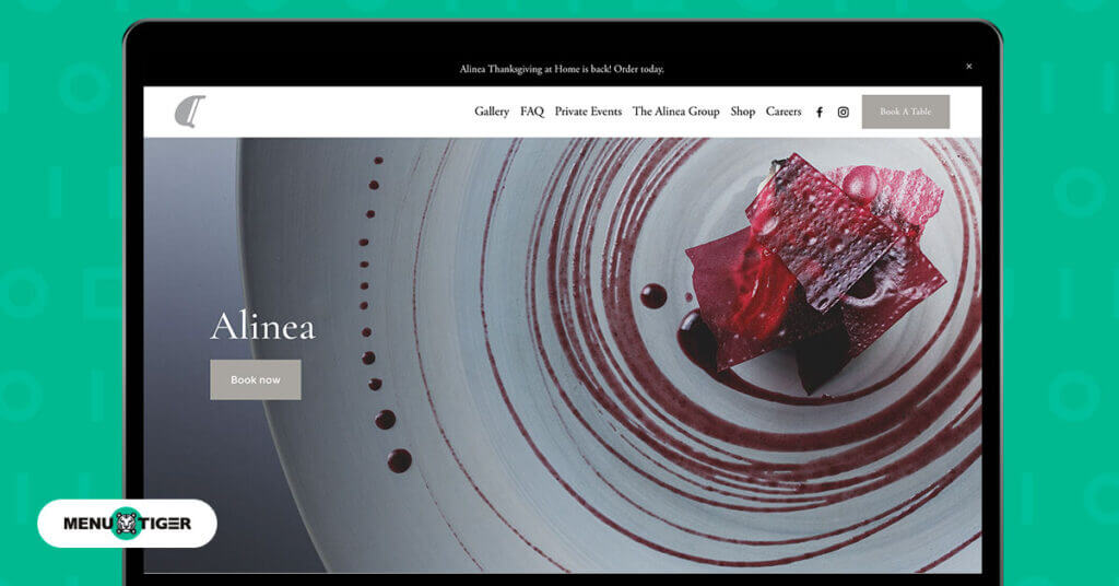
Alinea’s web design is more modern and sleek, mirroring the creativity in their cuisine. Striking images and videos breathe life into their dishes, and the interactive elements make you feel like you’re a part of their culinary journey.
The reservation is one click away, and you can also explore their blog right from the homepage.
The French Laundry (Yountville, USA)
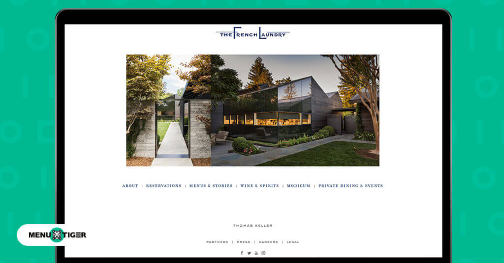
The French Laundry’s website is an embodiment of timeless elegance, reflecting the restaurant’s brand.
Its design oozes with sophistication, and it’s consistent with the restaurant’s reputation.
The stunning imagery, whether of their intricately crafted dishes or their charming garden, paints a vivid picture for their customers.
Apart from the easy-access reservation button, you can also stay updated with their social media updates and subscribe to their newsletters by simply tapping on the menu.
Disfrutar (Barcelona, Spain)
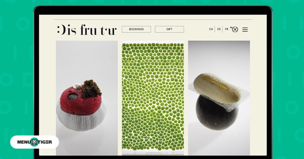
This Michelin-star restaurant in Barcelona boasts a website that’s as innovative as its cuisine. Right off the bat, you can see the creativity despite its simple appearance.
It’s a visual treat with engaging animations and images that hint at the restaurant’s artistic approach.
Disfrutar’s website is streamlined, offering easy access to their digital menus and booking system.
It also displays their current events, suggested wine pairings, and their staff that are currently working on specific stations.
Indeed, this should be part of your web design checklist for your restaurants’ online presence.
Osteria Francescana (Modena, Italy)
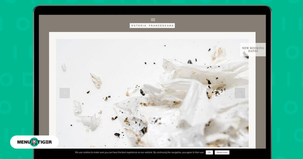
This Italian restaurant’s website is a reflection of Chef Massimo Bottura’s artistry.
From its strategic placement of the cuisine slideshow to the functionality of the buttons, customers will definitely get a hassle-free experience while navigating around the website.
Osteria Francescana’s main features are the transparency of their available booking dates, the total number of tables, and their navigable menu options.
So immediately, interested diners will know the specific dates of availability and will be able to book the tables outright.
How to create and design your own website with an interactive restaurant menu software
There’s really no need to look for website builders if you’re planning on developing your restaurant website.
What you’ll need is software that not only offers webpage development but also caters to all of your restaurant business needs.
MENU TIGER, a trusted restaurant software, is equipped with the right tools needed to establish websites.
Apart from its website builder feature, you can learn how to scan a menu and customize it based on your restaurant branding and visual identity.
Here’s how you can do it:
Sign up or create an account
Creating an active account is necessary so you can access the tools of the software. You can opt for a free trial or immediately choose a paid plan of your choice.
Enter the necessary information about your restaurant business
This is where you will input details like your restaurant’s name, locations, and operating hours.
Open the left-hand side menu, then click ‘Website’
You can locate the ‘Website’ option on the lower part of the left-hand panel. Once clicked, this will appear on your screen display:
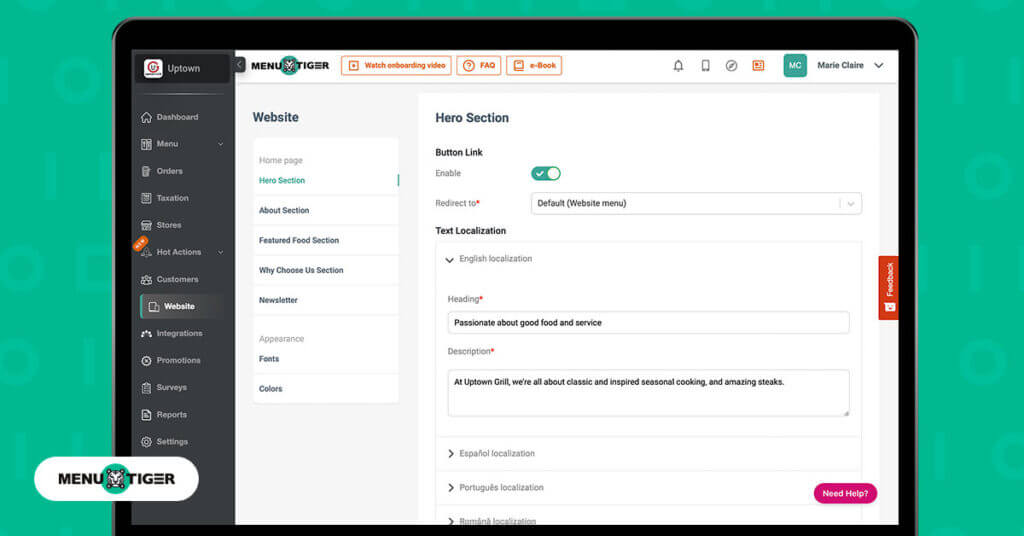
Hero Section. This is where you can create or customize the front or home page of your restaurant website. You can personalize the page’s heading, add the page’s description, and link your virtual menus‘ URL.
About Section. This section lets you provide further details about your restaurant. You can add a main image for the About page, a different page heading, and a page description.
Featured Food Section. Upselling, cross-selling, and other restaurant deals you want to offer appear on this page. This is where you can customize and showcase menu items like daily specials, recommended dishes, and the like.
Why Choose Us Section. As the name implies, this is where you will input all the marketing copy to promote your business. It’s a specific page on the website that provides the option to promote your restaurant and answer the question, “Why is it worth paying for?”
Newsletter. This is where you can customize the page that will compel your customers to click and subscribe to your newsletters.

Serve success through top-notch web design for your restaurants
Crafting the best web design for your restaurant isn’t just about aesthetics, it’s a recipe for success.
Though it can be a bit of a challenge for the non-tech-savvy restaurateurs, seeking help from reliable tools won’t hurt you. In fact, it might even save you some dime and time.
Take MENU TIGER as an example.
It provides you with all the basic tools for developing and customizing a restaurant website, such as easy integration of your social media channels, e-payment options, and newsletters, not to mention all the QR code menu designs available.
With restaurant software as user-friendly as this, you can craft a visually appealing, data-driven website that satisfies your customers’ appetites both online and offline.
FAQs
Belle
Belle Boralo is a seasoned Content Writer specializing in SaaS and marketing content, known for boosting website traffic. Her background in writing essays and journalism and her love for the outdoors infuse her work with a unique and vibrant energy.


